Wednesday, September 30, 2015

Unusual and Interesting Photos

Part 1:

1. My reaction to Christian Rhum's photography was mainly surprise. His work was like nothing I've ever seen before. It was quite beautiful and awe-striking, and I really enjoyed looking at his photos. I could not stop looking at the different pictures because they were so amazing and different. The originality and uniqueness was my favorite part.

2. I think he made these works by taking many different pictures of the same thing (at different angles/viewpoints) and combining them all to create these wobbly masterpieces. It would take a long time to make each photo, but the end result was incredible.

3. A good building to use this technique on would be either the Austin Capital, Texas Tower, or the downtown Austin Frost Bank building. These buildings are all pleasing to the eye and well known so many people would recognize them. They are all located in downtown Austin and the Capital and Tower are both relatively near each other. The buildings are easily accessed because they are set on public street downtown, so they would be easy to take photos of.


Part 2:

Part 3:

1. The three most important suggestions to remember while out shooting for photographers:
- Look for the quiet moments as well as the "bigger than life explosion" moments (Painting #4)
- Do not let an awkward angle deter you from your inspiration. Take a shot even if you take to look straight up (Painting #11)
- Never stop looking for the right angle to take a photo (Painting #18)

2.

3. 

4.  The suggestion was to know how to take a photo of a reflection/take a photo showing perspective. This photo uses both a reflection and perspective in the image, so yes the photographer followed the suggestions given.

5. The style of painting that might influence me is the idea of using different angles to get your picture and not hesitating to either climb on a chair, lay on the floor, or get on your hands and knees.




Thursday, September 24, 2015

Academics & Community Service Photos/Shoot

My favorite photo was of a girl in an art class who was pouring vibrant pink paint onto a black object. When the paint hit the surface it bounced up causing it the splatter everywhere in the frame.

  1. I picked this photo because it is very interesting the look it and I like the bright colors in it. I liked how the girl in the background who was pouring the paint was not completely in focus. The paint splatters were the subject of the photo and this made a cool effect. Overall, the photo is fun to look at.
  2. One of the rules of photography in this picture is the rule of simplicity. The only things in the frame are the girl and the pain splatters which lets the viewer focus on the subject of the photo.
My Shoot:

  1. I think I could get pictures like the ones I viewed today by going into classes that are conducting interesting activities. I should go to either a science class that is conducting a lab, or a class that is having academical games/activities that day like the History classes doing the Greek Olympics.
  2. I would like to go to Mrs. Kowalik's room to get pictures of here biology students doing labs. I would also consider going into Ms. Holloway's class to get pictures of either her tech students or her theatre students. Also, I would go into a Spanish or French class that is doing fun activities in order to learn their new language.
  3. In order to get amazing photos like I viewed, I will get different angles of the camera and get on different levels, whether that be laying on the floor or standing on a table. Also, I will use the rules of photography that we have learned so that my photos can be the best I can make them. I will also take this shoot very seriously so that I can become a better photographer and improve my skills.

Filling the Frame


In this photo, there is a lot going on and it is all very interesting to the eye. The frame is filled with dark colors, but there is a patch of light that catches the attention of the viewers. The smoke fill the bottom of the frame and illuminates the two figures in the photo. Without the light from the smoky area, the figures would also just melt into the shadowy background. The light reflected on the masks of the figures is colorful and this is a good added effect to the photo.

Action and Emotion

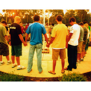
"For where two or three are gathered in my name, there am I among them." (Matthew 18:20) The body of students from Fox Creek High School gathered around their school's flagpole to pray for the school, students, staff, and year. There is a lot of emotion in this picture because it demonstrates the power of coming together. The students were able to step out publicly to pray for a cause that they truly believed in.

The Story


The photo tells a very interesting story. The picture viewed displays a body of students feeding a homeless community. Giving back to their community, the students are willingly giving up their time and efforts to help others in need. The photo leaves the viewer wondering what happened next. The story behind this picture gives the viewer a sense of happiness and content because it is satisfying to do the right thing.

Tuesday, September 22, 2015

Photo Manipulation and Ethics

Part 1:
In the article, one of the main points was how it is wrong to manipulate images to appear different than they actually are seen as. The altering of pictures caused many different photographers to lose their jobs when the companies discovered the lies behind their photos. The companies wanted real images and they wished to have images that were perceived exactly as they were supposed to be.

This type of photo editing is unethical because it gives the viewers false information. The images could cause people to believe things that are not true, and we do not want deceit and lies in the pictures.

Part 2:

This altered photo that appeared on the cover of the news is the most unethical of the ones I saw. It is the worst because the debate that is depicted on the front never even occurred. The photographer was faking a political event that was nonexistent and he was lying to the public about it.


In this photo, the pyramids were manipulated to be closer to each other in order to get the full picture on the cover of the magazine. Out of all the altered photos I saw, this one was the least unethical. It is not as bad because it is not faking an event or occurrence. Instead, the photographer just moved the pyramids closer to one another. It is still not ethical to do this, but it is not a wrong as being dishonest about politics and other things.

Friday, September 18, 2015

Great Black and White Photographers Part 2

The famous photographer Andre Kertesz was born on July 2, 1894 in Budapest, Hungary. Andre had a basic education. He began work at a bank in 1912, which was the same year he started working with photography. In 1914, Andre went into World War 1 and served until her was severely injured. While he was serving in the horrible war, he also photographed many things including the warfront. After being injured, Andre went back to working at the bank in 1918. In 1928, Andre married a woman by the name of Rozsa Klein, but later they divorced in 1932. He married Erzsébet Salamon in 1933. Andre worked as a photographer for many different magazines which include Vogue, Look, Harper's Bazaar, and others. Some of his published books consist of On Reading, written in 1971, André Kertész: Sixty Years of Photography, 1912-1972, written in 1972, Kertész on Kertész: A Self-Portait, written in 1985, and J'aime Paris: Photographers Since the Twenties, written in 1974. Andre later died at the age of 91 on September 28, 1985 in New York City, New York.


Post Shoot Reflection

1. The only challenge I encountered during this prompt photo shoot was coming up with ideas on how to interpret the words (happy, metal, bowie, and square). I found that coming up with creative picture ideas was difficult, but I figured it out.

2. I found myself mostly thinking about the focus and angle of the camera. The focus is very important and I wanted the pictures to all be focused perfectly on the right things. The angle of the camera just added another aspect to the photo. In order to do this correctly, I would switch the camera to manual focus so I could get the right focus. Also, to get the right angle I would either get down onto the ground or stand up on an elevated object to change the viewpoint.

3. If I could do the assignment again, I would take time to really think about the pictures I was taking and try to apply all the rules of photography to them.

4. I would continue to get different angles of things and focus well on the subject of the picture. Also, I would continue to use the rules that I did.

5. In picture posts

6. I would be interesting in shooting "happy" and "Bowie" again because they are fun to take pictures of and they are very dynamic topics.


http://isabellasphotojournalismblog.blogspot.com
  • Her pictures were well thought out and for the most part in focus.
  • I really liked her picture for the prompt "square" because it was unique and had a very nice white background. She used the rule of simplicity and the rule of thirds very well.
  • The one thing that could be improved in her pictures would be the lighting. Her pictures were a little bright and the sunlight seemed to wash out the photo.

Wednesday, September 16, 2015

Metal


The photo for the prompt "metal" is an example of the rule of lines. The angle of the camera with the line of lockers causes the person's eye to automatically go down the row of metal lockers like it is some sort of path to follow.

Merger


This is my example of a merger photo. It is a merger because of the white and green sign behind the flowers. The sign distracts from the flowers and it is the first thing a person sees when looking at this picture.

Square


The picture for the prompt "square" uses the rule of thirds as well. The square brick is in the lower left-hand corner, and this is more attractive to the eye rather than having it centered.

Bowie


For the prompt "Bowie," I used this picture of the flower. This photo uses the rule of thirds, as the flower is in the lower right-hand corner. The reason I took this for the prompt is that the building of Bowie is in the background. There are also many different colors in the picture, which represents the diversity of Bowie.

Happy


I used this photo for the prompt "happy" because the subjects in the foreground are laughing and being genuinely happy and they are enjoying one another. In this picture, I did not really use any of the rules of photography. Although, it kind of uses the rule of balance, as the subjects are pretty evenly distributed throughout the picture.

Thursday, September 10, 2015

Avoiding Mergers


This picture is an example of a merger. The sign in the background interferes with the subjects, which are the flag and the man. Without the sign, it would be a very good picture, but because of the merger the eye is drawn to the sign instead of the intended subjects.

Framing


In this picture, the man climbing the ladder is framed by the hole in the wall. The frame, created by the the blown-out hole in the wall, lets the eye focus on the subject, which is the man.

Balance


This picture uses the rule of balance because there are many geometric shapes formed by the subjects. There are especially many triangles formed by the firemen, the flag, and the pole. 

Lines


This photo is one of the most powerful pictures taken on the day of the 9/11 attacks. It uses the rule of lines because the vertical lines of the building lead the eye to see the falling man, as he is parallel to the lines.

The Rule of Thirds


In this photo, the fireman is sitting down in the lower left-hand corner, which applies to the rule of thirds. This is more appealing to the eye rather than having him centered. Also, the use of this rule allows the person looking at the picture to see more of what is going on to the left of the man.

Simplicity


In this picture, there is not much going on so the person looking at it will be able to focus on the subject, which in this picture is the gash it the building wall where the plane flew in. Because of this, the photo is a good example of the rule of simplicity. 

Thursday, September 3, 2015

The Camera: History and Information

The Camera
1. "Camera obscura" is latin for "dark room". Around 500 BCE, philosophers learned how to make the first camera. They took a dark room in which there was one tiny hole in a wall, and through this hole the light was focused and seen on the opposite wall was an upside-down picture of the scene outside.
2. Something that helped man get one step closer to the modern camera in the 17th century was when Isaac Newton and Christian Huygens were able to understand optics and how to make high quality glass lenses.
3. The parts of the first modern camera, invented by Niepce, were a glass lens, a dark box, and film.
4.  Modern day digital cameras and Niepce's camera both work the same way: light passes through the lens, into the body of the camera, and this exposes the film. In the end, both cameras make a photograph.
5. Digital cameras use an electronic sensor, a CCD, to capture an image.

Camera Modes
6. Auto Mode is when the camera controls the flash and exposure, while Program Mode is when the photographer controls the flash and a couple other settings.
7. Portait mode is used to blur out the background of a photograph. It uses the fastest lens setting, which is also referred to as aperture.
8. Sports mode is used for taking pictures of things in fast motion. It freezes the motion, and it uses the fastest shutter speed available.

The Half Press
9. A photographer should use a half-press on a trigger button because it helps the camera to lock focus on the object and have a faster full-press response.

Controlling Flash
10. The symbol with a line through the lightning bolt means that the flash is disabled. A photographer would use this when they want natural light for their pictures.
11. The symbol with a lightning bolt and the word "auto" means that the camera will automatically use the flash if the picture seems to need more light.

Introduction to Exposure
12. If there is too much light in a photo, it will be washed out.
13. If there is not enough light in a photo, the picture will be too dark.

The Universal Stop
14. A stop is a  term used to represent a relative change in the brightness of light.
15. If a planet has two suns instead of one, it will be one stop brighter.
16. If there are four suns instead of two, the planet will be two stops brighter.

Shutters and Aperture
17. A long shutter speed will result in the picture being exposed to more light.
18. A shorter shutter speed will result in the picture being exposed to less light.
19. The aperture controls the amount of light that reaches the picture.
20. When adjusting the aperture, you can increase the amount of light by setting the aperture to a larger opening.

Tuesday, September 1, 2015

Great Black and White Photographers


Robert Adams
"North Jetty"


Andre Kertesz
"Feeding the Ducks in the Late Afternoon"


Josef Koudelka
"Czechoslovakia"

First Day Photos

I was absent for this assignment